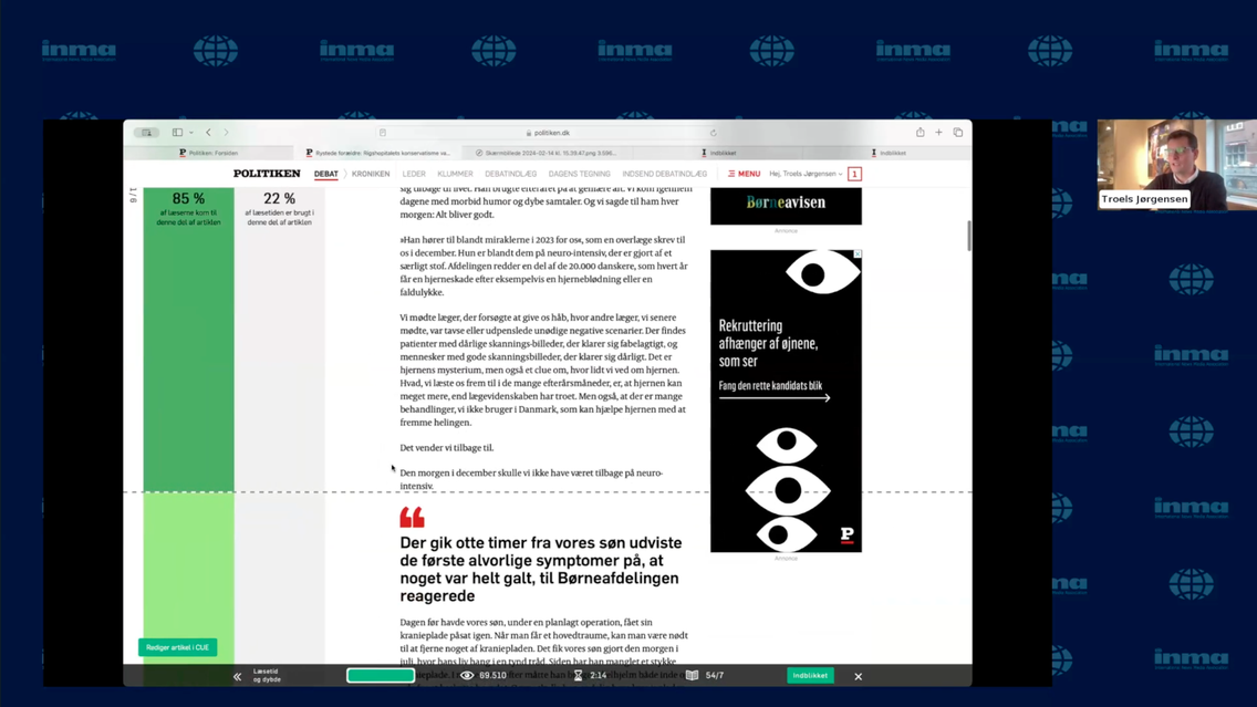
To make sure journalists can actively follow the performance of their work and quickly make updates and improvements in Cue, Politiken has integrated data analytics and dashboards directly into their website. The integration enables journalists to access relevant data for each story they work on. And the way a story is performing is displayed in a surprisingly simple way: A green bar to the left of the story displays key metrics, such as reading depth and engagement levels.

This feature is designed to provide immediate insights into the performance of articles.
In terms of content strategy, Politiken has developed various templates for articles, categorized by length from Small to XXL. This approach is part of Politiken’s broader strategy to offer a diverse range of content on their site.
Politiken’s data dashboard also informs content creators on engagement parameters for each article, covering seven different data points, including page views, average reading time, and the impact on subscription sales. These metrics are weighted differently, reflecting the newsroom’s strategic focus. For example, the number of subscriptions generated by an article is considered more significant than mere page impressions.
In the webinar, Troels Jørgensen emphasized the goal of moving away from traditional, static reports on traffic and engagement. The integrated data approach at Politiken is designed to allow journalists to independently analyse and understand the digital performance of their content and enable journalists to react and adjust quickly: A button in the lower left-hand corner of the article takes the journalist to directly to the story in the Cue platform to make adjustments and enrichments to drive more engagement.
